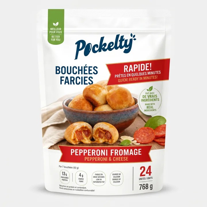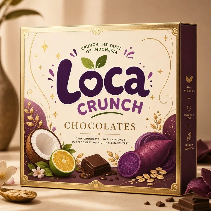
Give the front one clear job
A front panel cannot say everything at once. Start with the product: what it is, which version it is, and why somebody might want it. If the flavour name, brand name, benefit and illustration all compete at the same size, the customer has to do the editing for you. Reduce the number of first impressions.
Test the design at shelf size
A zoomed-in canvas makes tiny details look important. Export a preview, reduce it until the package is roughly the size it would appear on a shop shelf, and look away for a moment. Look back for two seconds. Whatever you can still identify is the real hierarchy. Use that test before polishing textures and decorative copy.
Make colour do repeatable work
Colour is useful when it has a job across a range. A stable brand area lets the family belong together; a changing flavour area helps customers find the right version. Do not rely on colour alone. Keep the variant name readable so the design works under different lighting and for people who distinguish colours differently.
The side panels are part of the experience
Move supporting information to the faces that reward a closer look. Keep the opening instructions where the hand will go, and avoid letting a fold split a crucial word. A flat layout can hide upside-down panels. In CraftyWand, inspect the structure in 3D before deciding that the typography is finished.
Leave the last decision to a physical proof
A mockup is excellent for orientation and balance. It cannot tell you exactly how ink, board texture and finishing will behave together. Print a rough full-size sample for reading distance and request the appropriate production proof from your supplier. The screen is a design tool; the proof is a different kind of evidence.
Put the idea to work.
Choose a model, bring your own artwork and start building in CraftyWand.
Open CraftyWand free ↗Useful starting points
CraftyWand: current tools and free account access · Dieline library · Pacdora: current plans and features